Agenda
- Website scavenger hunt review
- Inspecting fonts with Chrome DevTools
- Figma typography tools lecture & demo
- Break
- Recreate & reimagine assignment
Announcement: Media Futures Interns
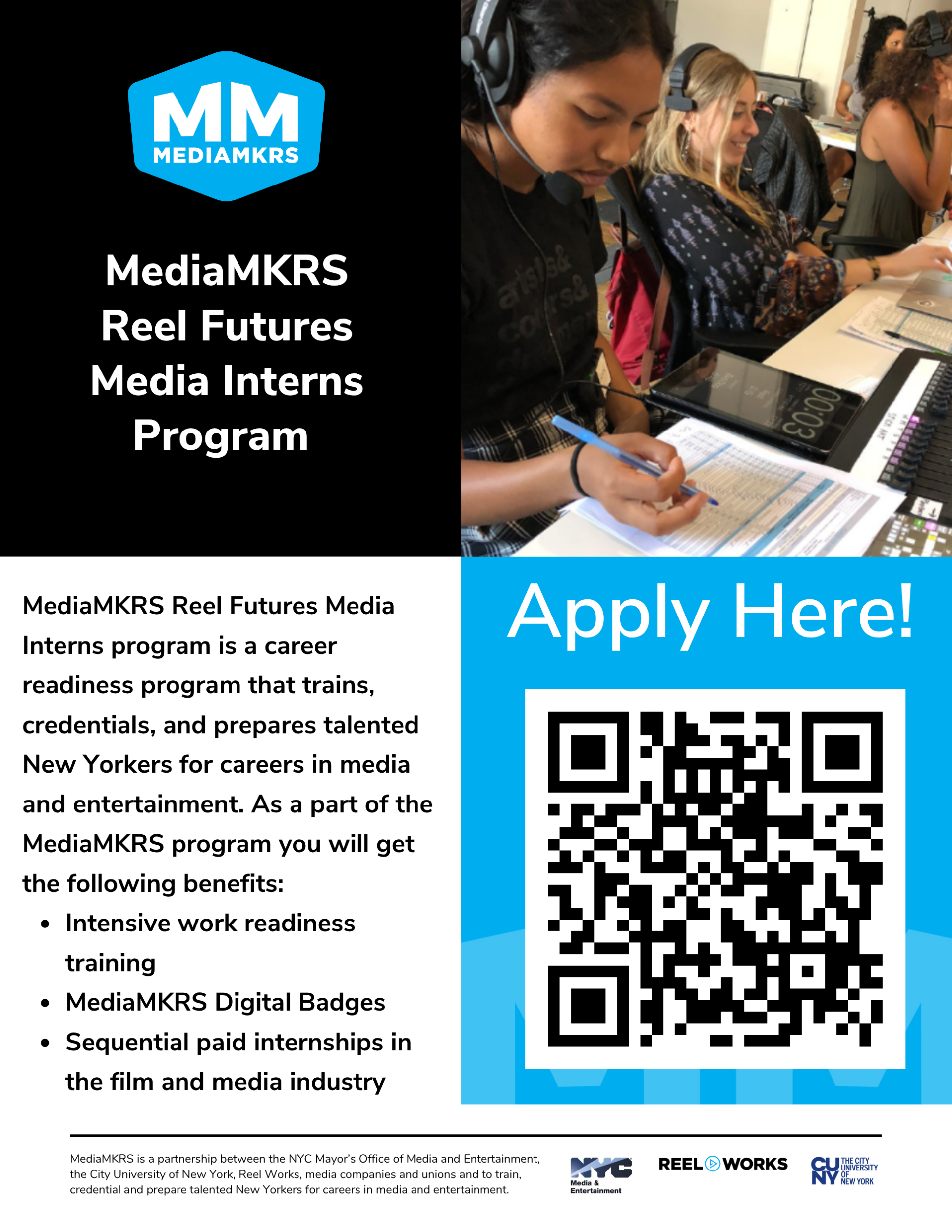
- Brief info session on on Thursday, September 24, at 5:45 p.m. in M-122. The session should run approximately 20 minutes.
- 3 credits for internships like this under the class HUW 260 Experiential Learning
- Any questions, email Sarada Rauch srauch@lagcc.cuny.edu
Website scavenger hunt
We'll review your examples from the Internet Scavenger Hunt.
You will get into pairs and talk about the following:
- What you liked and didn't like about each of your findings
- What is the goal? What is it trying to get you do?
- How do you navigate or interact with the website?
- How does it make you feel?
We will categorize each type of website into groups — ecommerce, content, game, portfolio, etc — together.
Inspecting fonts with Chrome DevTools
You can find out exactly what font a website is using with Chrome's built-in DevTools:
- Right-click directly on the text you want to check, and choose Inspect. This opens the DevTools panel with that element already selected.
- In the Elements panel, look at the Styles pane on the right — find the
font-familyproperty listed there. This shows you the font (or fallback list of fonts) applied to that text. - For an even clearer view, click the Computed tab (next to Styles) and
scroll to (or search for)
font-family. This shows you the actual font being rendered, after all styles have been applied.
Lecture & Demo
We will look at the typography tools available in Figma:
- font picker
- font size
- line height
- weight
Break
Assignment: Recreate & Reimagine
Due Tuesday, October 1
- Take one of the examples you pulled from the Website Scavenger Hunt.
- Recreate it in Figma — match the original's layout and text hierarchy as closely as you can (what's the headline, what's body text, what's a button or label).
- Reimagine it using three different typeface options. All three must live in a single Figma frame, laid out so they can be compared side by side.
- For each of your three options, write a short explanation (1–2 sentences) of why you chose that typeface — how it changes the tone, legibility, or feeling of the site compared to the original.
Requirements
- One Figma frame containing the recreated layout and all three typeface options
- Each option must actually change the typeface, not just the size or color
- A short written rationale per option, referencing at least one concept from class (hierarchy, weight, kerning, line height, or serif vs. sans-serif)
Submit via Brightspace.
Rubric
| Category | Excellent | Proficient | Needs Improvement |
|---|---|---|---|
| Recreation accuracy (25 pts) | Layout and text hierarchy closely match the original | Layout is recognizable but hierarchy is unclear or inconsistent | Layout doesn't reflect the original's structure |
| Typeface exploration (25 pts) | Three distinct typefaces, each a thoughtful fit for the site's purpose and tone | Three typefaces present, but some choices feel arbitrary or mismatched to the site | Fewer than three typefaces, or choices show no real consideration of fit |
| Written rationale (25 pts) | Each explanation clearly connects the typeface to tone, legibility, or a class concept | Explanations are present but vague or generic ("it looks nice") | Rationale missing or doesn't relate to the typeface choice |
| Craft & execution (25 pts) | Frame is clean, organized, and easy to read at a glance | Frame is functional but cluttered or inconsistently spaced/aligned | Frame is difficult to follow or incomplete |